
Creating an ATSC 3.0 Broadcast App
Ways to differentiate yourself in the Television Industry is becoming more difficult. One way to do that at Evoca was to provide an interactive application experience over the air to customers.
To do that, we had to understand the limitations of ATSC 3.0 Broadcast Applications. For instance, fade animations do not work on the particular streaming box that will be rendering the application. So when one would traditionally use this type of animation is to help with the transition of views on web and mobile, we were not able to do that. Providing adequate user feedback while staying within the constraints of the hardware was just one of the many road bumps we would encounter.
National Womens Soccer League
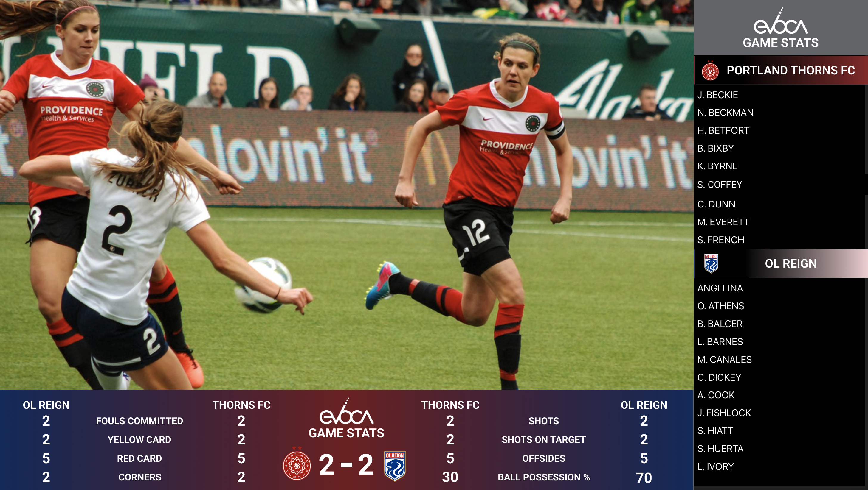
We partnered with the Portland Thorns FC on our initial release of the application. The scope of the application would be real-time stats of the match that would include Seasonal and Match stats for Teams, Players, and the match-up comparison. Initially I provided a basic mock-up to illustrate basic layout, navigation and how the app would be launched from the remote.
I utilized Axure RP 10 to show this dynamic example with a video of a Thorns match embedded. It helped provide the team with enough to discuss further requirements of the project and what stats we would want to show to users for each view. I worked with Director of Product on narrowing down those stats. Once we finished finalizing the list of appropriate stats I began working on each individual view in Figma that users would navigate through.
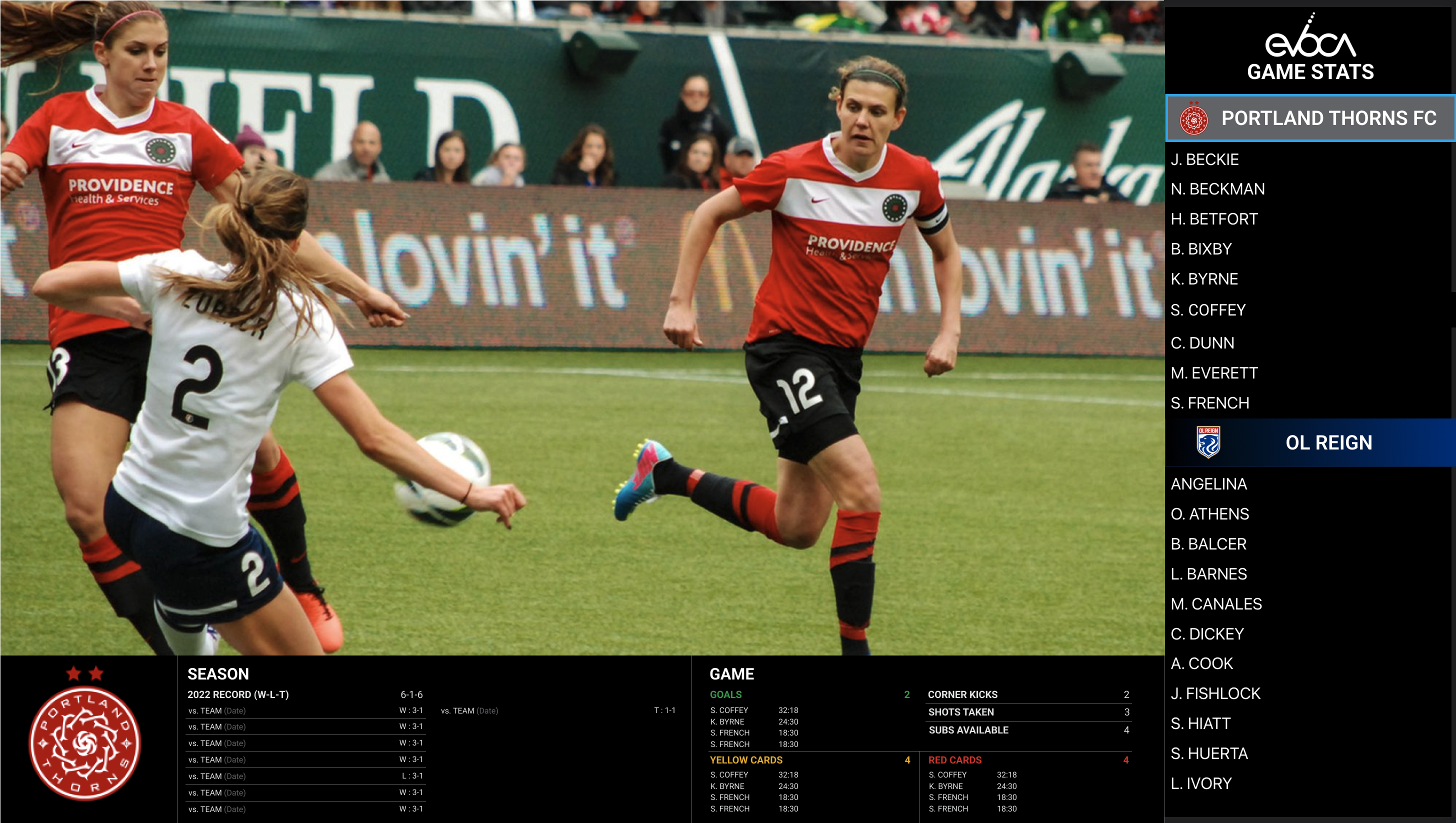
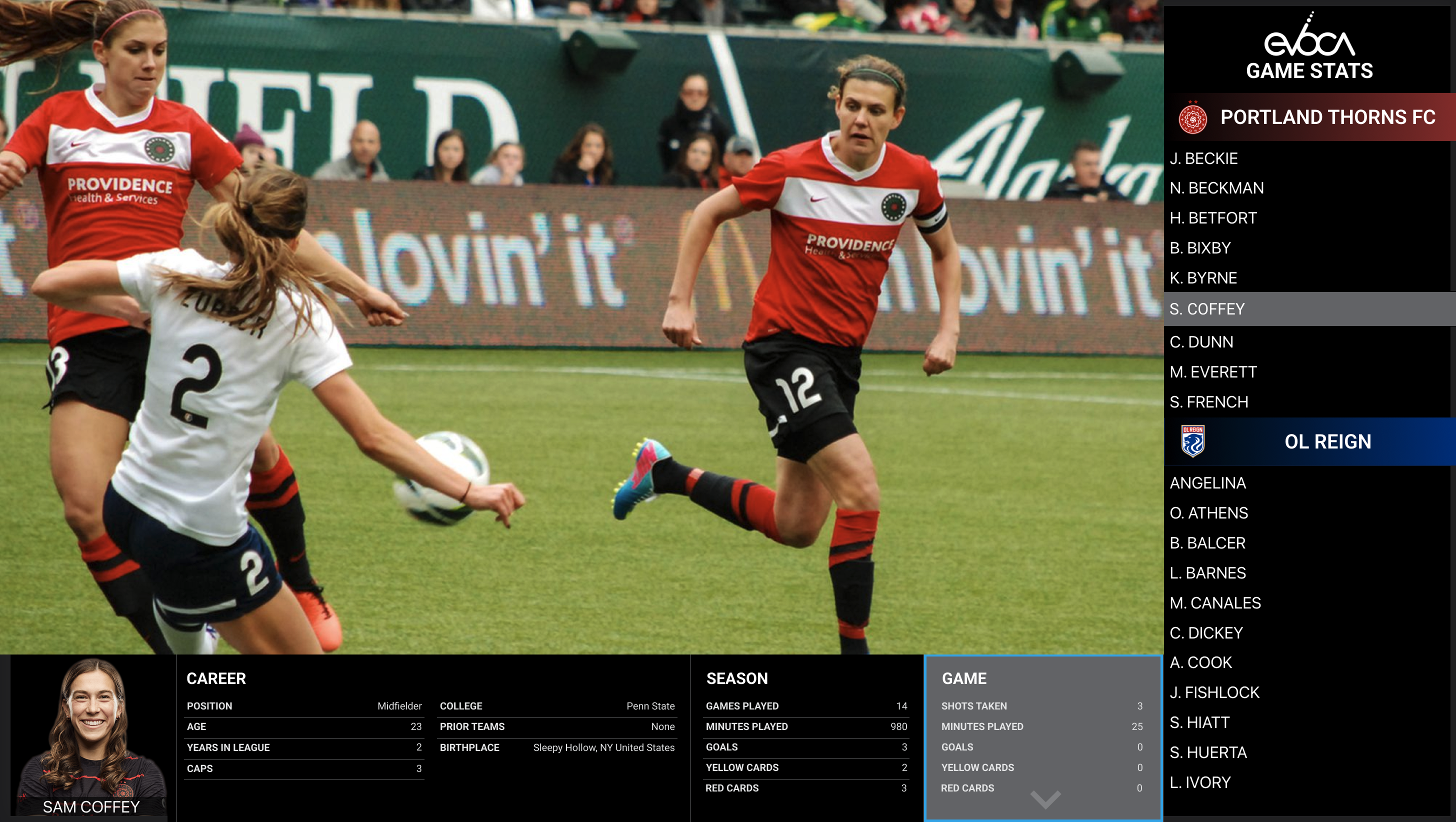
These mockups were approved by stakeholders and I worked with our engineering team to implement. Once implemented we had QA test on a few live events internally prior to releasing to production. As the season progressed and more users were utilizing the broadcast app during NWSL Matches we received valuable feedback from both internal and external sources.
Portland Trailblazers, Iteration, and Updates
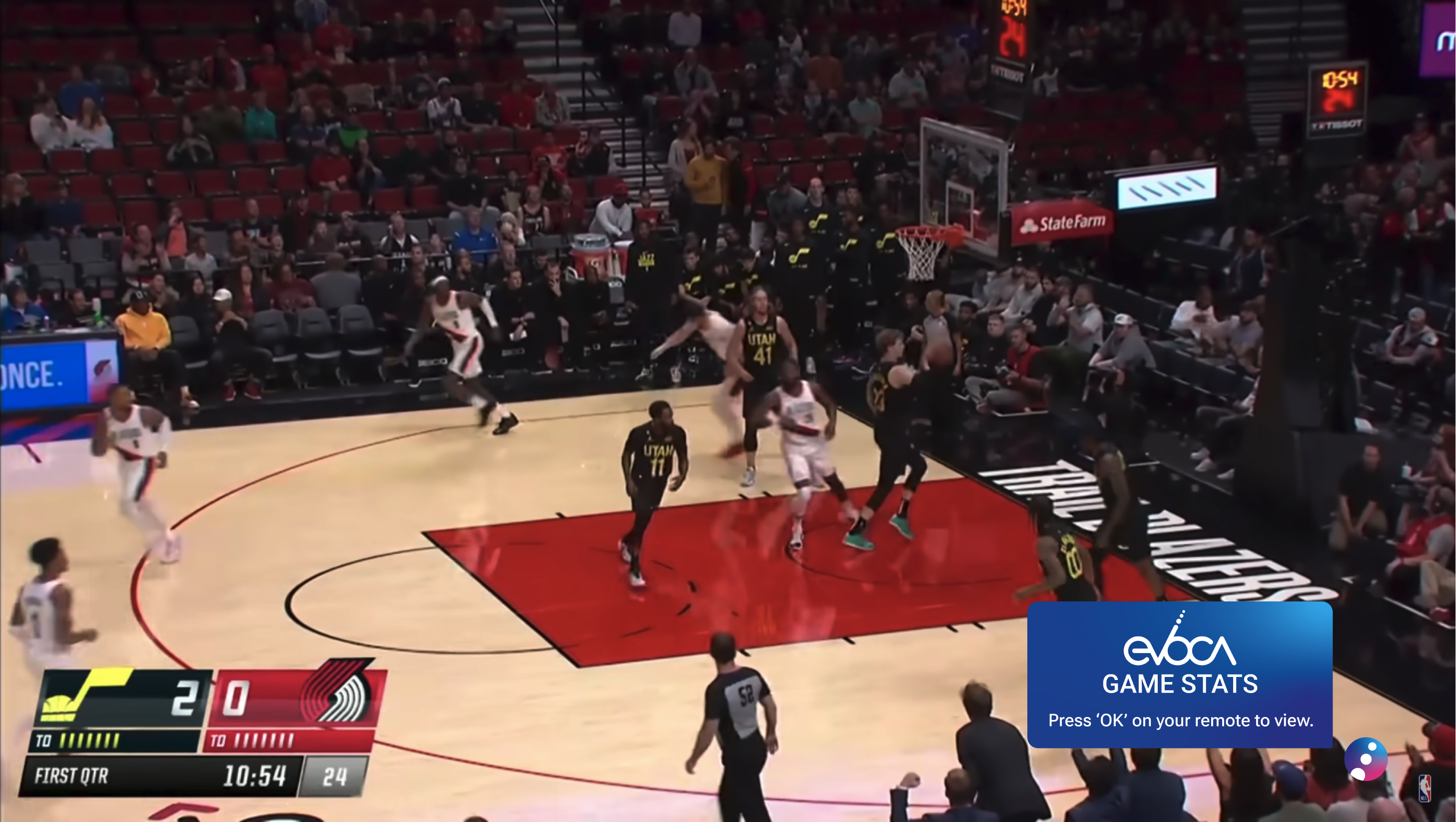
During our implementation of NBA Stats one issue that kept coming up was the on screen 'bug' that we used to indicate advanced stats were available via the broadcast app wasn't clear enough. We needed to come up with a way to let users know that by pressing 'OK' on their remote, it would launch the broadcast app on their device. This type of feedback is tricky as the 'bug' isn't like other navigation items on the device, in fact, it's not a navigation item at all but more like a 'notification' you get on your computer, phone or tablet.
The confusion was happening because many users would try to navigate to the bug on screen but this wasn't possible as the arrow buttons on the remote were mapped to different items on screen. To help alleviate this issue, I suggested implementing a pop-up on screen that shows briefly when you first tune to the channel.
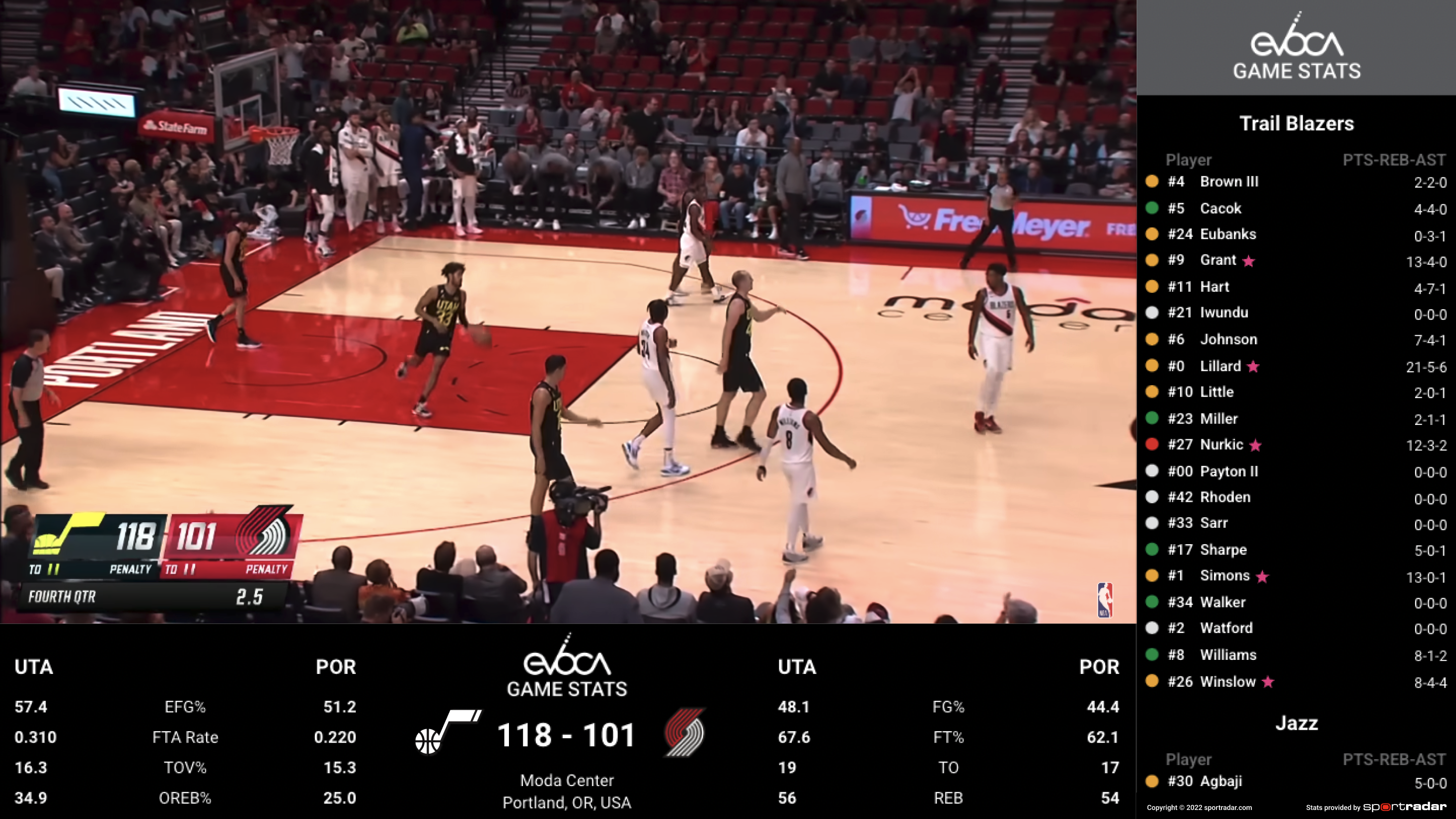
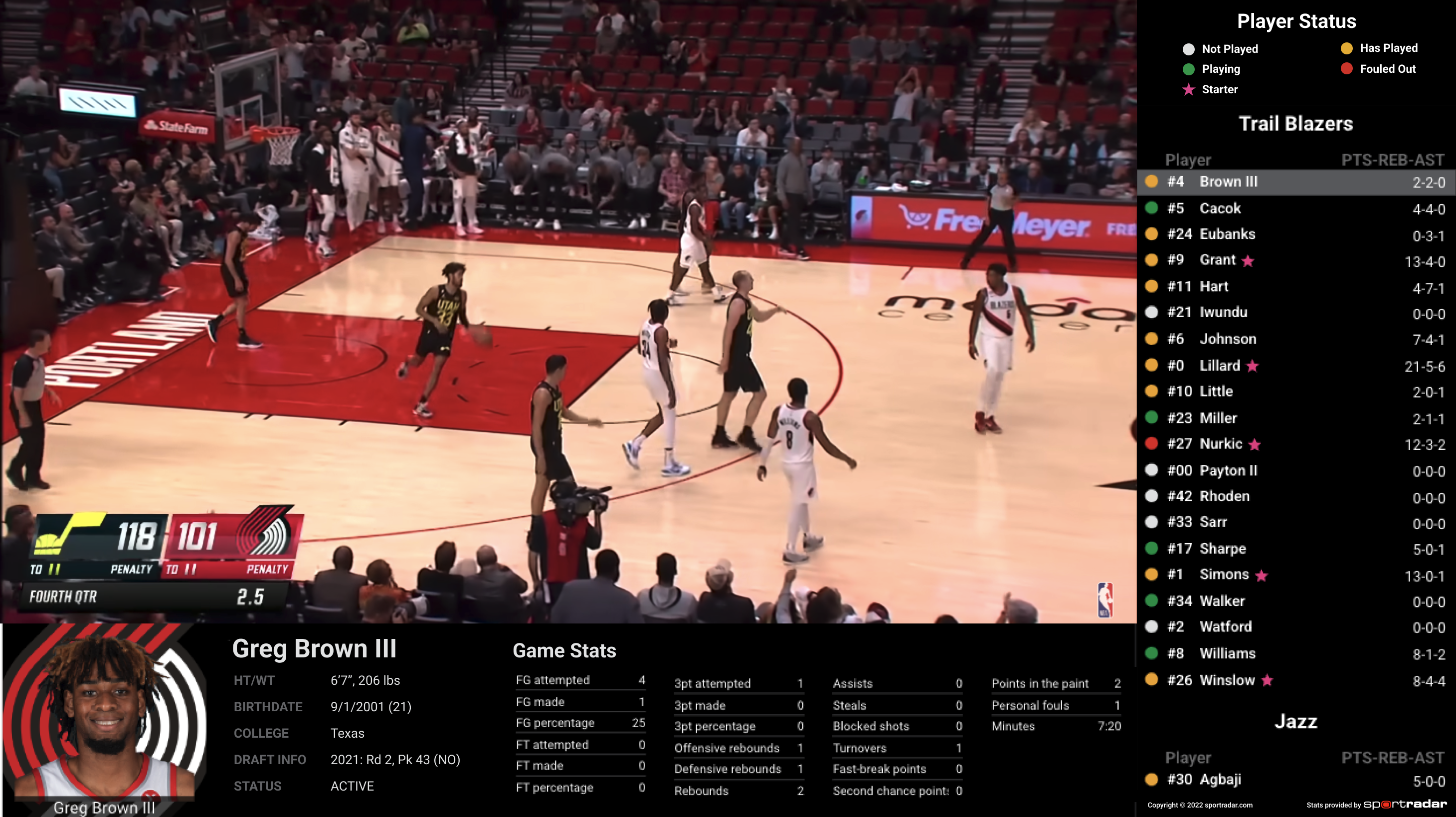
Additionally, we added in other types of feedback to help end users follow the game easier while viewing the broadcast app stats. I applied colors to indicate that a player is 'Playing', 'Has Played', 'Has Not Played', and 'Fouled Out'. I wanted users to be able to glance on the roster list and quickly see the status of each player without having to navigate anywhere on screen.
Feedback was provided that some users might not understand the color indicators so I updated the broadcast app header to switch to a legend to help identify each color when you navigate to the individual player views.
Conclusion
As the seasons for both NWSL and NBA progress, we continued making changes based on feedback and how the app performed on our devices. For instance, I altered to font family and weight to help with readability after viewing on smaller TVs. I also tried to go with a dark/flat theme overall to help make sure the stats or color indicators drew your eye. This type of application technology is in its infancy and will continue to grow and become better but for a first implementation in this space, I am very proud of what we provided our end users.