
Updating Buyflow Experience
An easy to understand buyflow is vital to convert users to customers. This can get complicated when there are both required and optional items in the same flow.
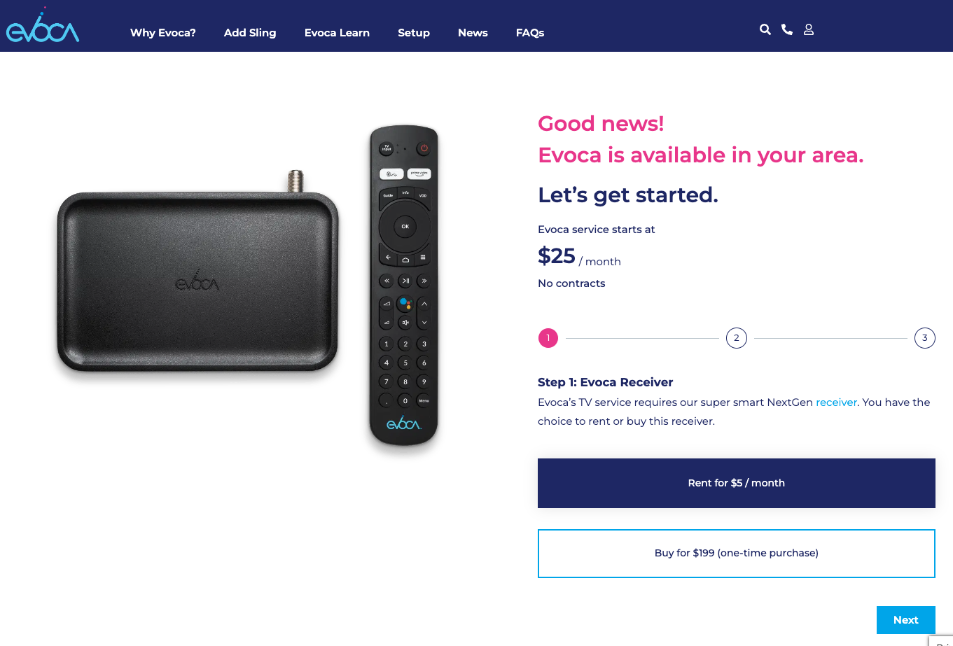
In this case study, the current buyflow was a combination of front-end marketing experience setup on Wordpress CMS with the e-commerce handled via Salesforce Communities. Engineers took selections made from the Wordpress CMS and sent them to a specific Salesforce cart to finalize checkout. This process works well but also has limitations, the most obvious one is altering your selections. As it stands, users have to go back and forth both from Salesforce to Wordpress CMS and also within the Wordpress CMS step flow for each selection they've made.
Updated Recommendations
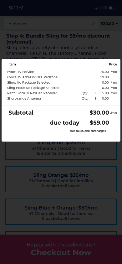
The prototype was built with Axure RP 10 so that stakeholders could get a real-time feel for the experience. I also added in logic to account for quantity, pricing adjustments, etc so that the cart pop-over would update as you made selections.
To help speed up development, I used existing designs that had been approved by stakeholders. Following branding guidelines for colors, typography, and existing components that are utilized within the Wordpress CMS. The idea for this update would call for customized ReactJS components be built that will be embedded into the Wordpress CMS front-end. This allows for marketing and branding to continue making their adjustments as needed without development time.
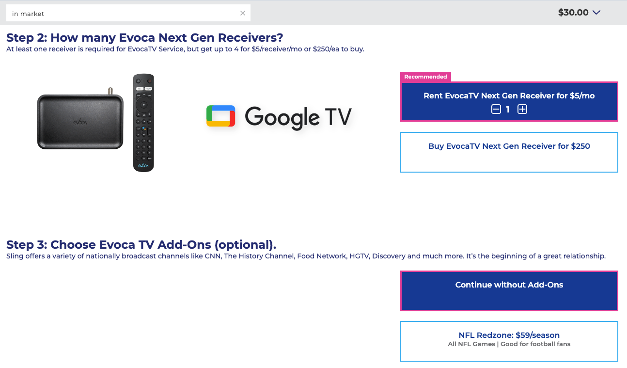
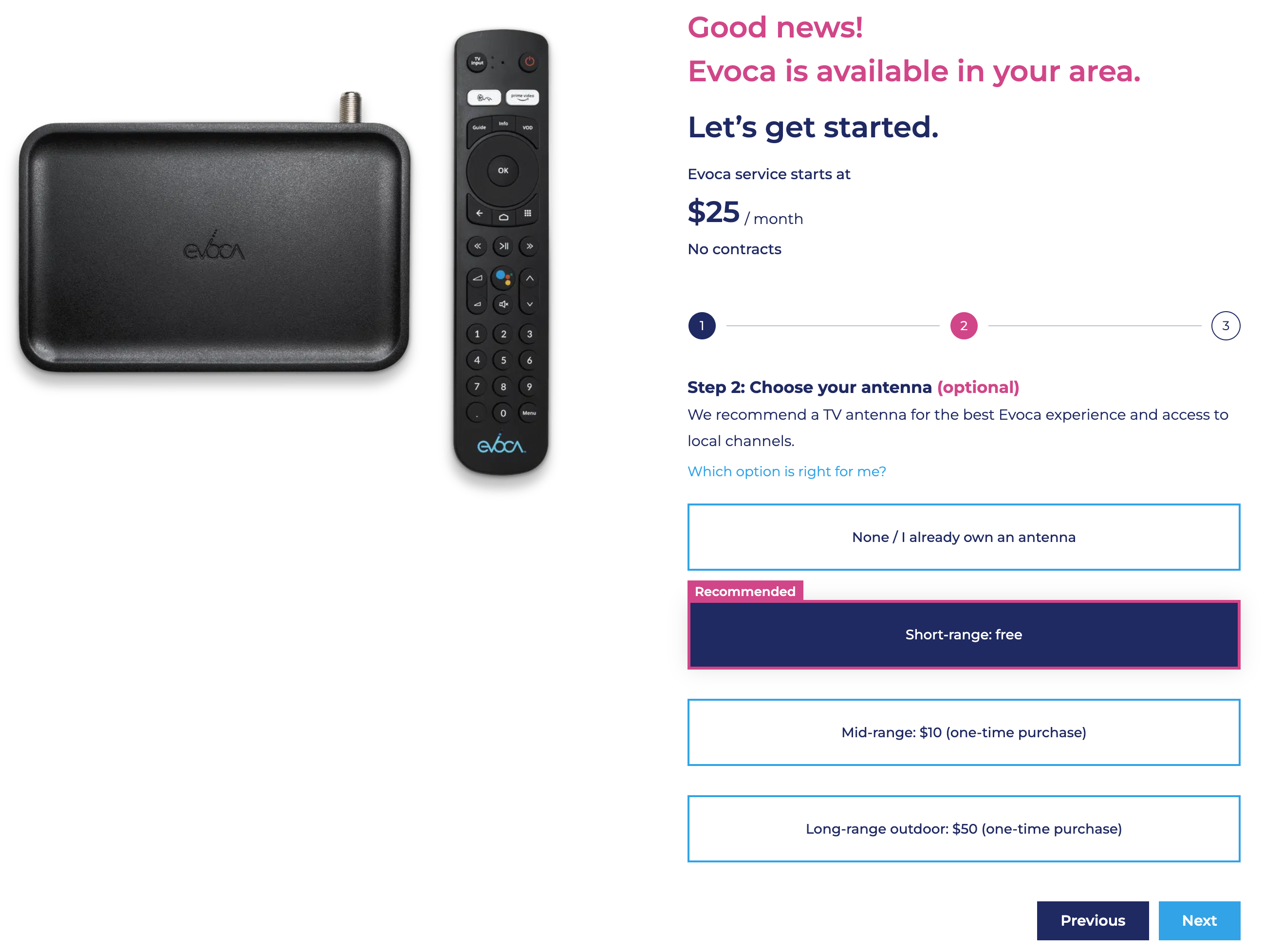
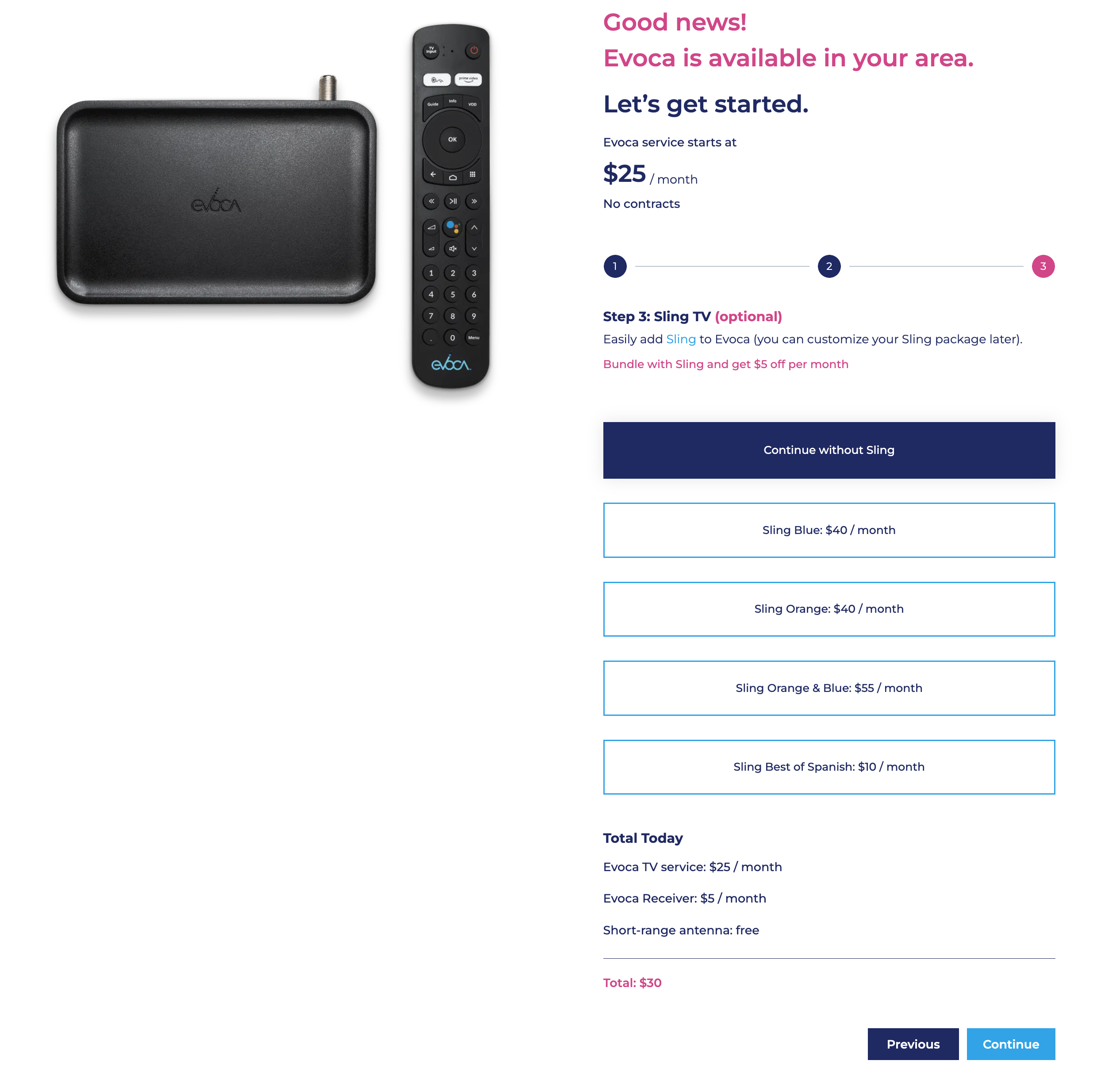
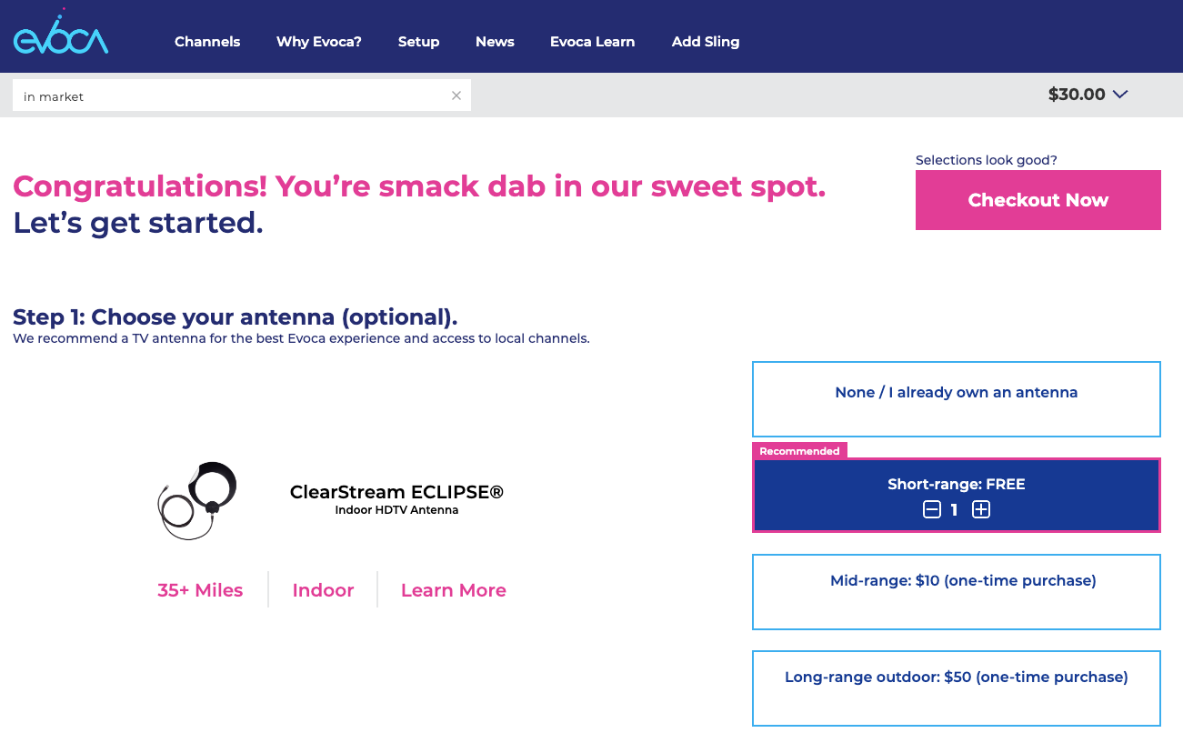
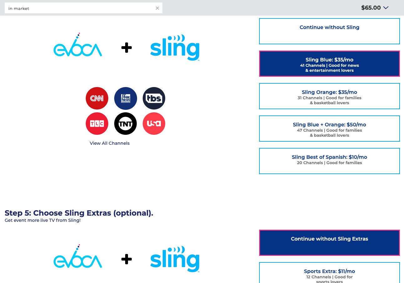
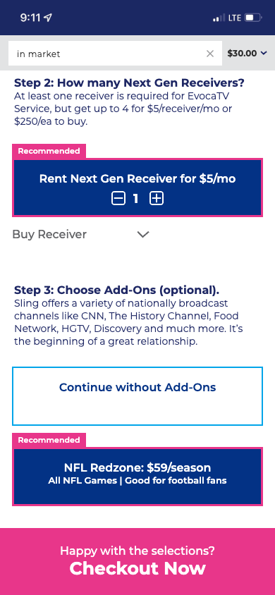
As you can see from the views, this design calls for a single page approach so that all selections can be made without having to navigate away from the current page. This also allows for the cart modal to be visible at anytime while scrolling so that users are able see the updated total as they make adjustments/changes to their selections.
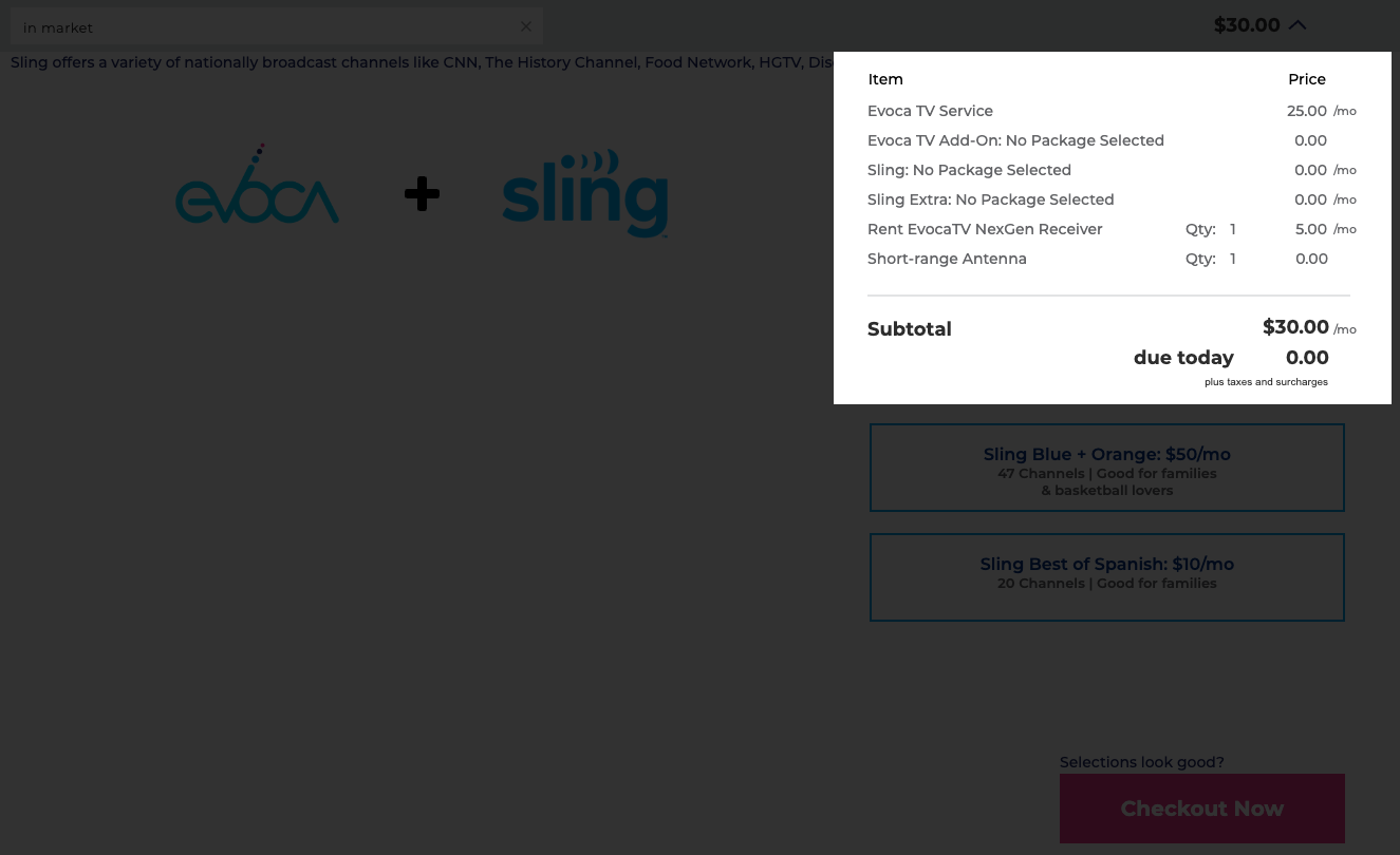
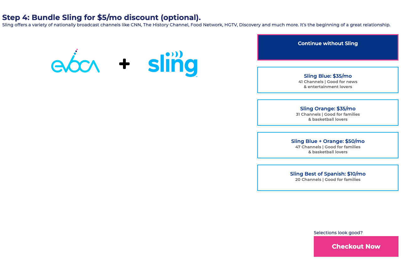
I also recommended the approach that hides relative options. For instance, hiding the Sling Extras until you've made a selection on a Sling base package. This approach helps save scrolling space along with providing feedback to the users selection to help draw their eye to the additional programming that is available. However, if they choose to continue without Sling, then why show them the Sling extras? One could argue that showing them the extras might entice them to purchase the appropriate base package, but in this case Sling extras are based on the Sling base package that is chosen, so it would lead to almost infinite scrolling to show all items that are available.
Mobile Recommendations
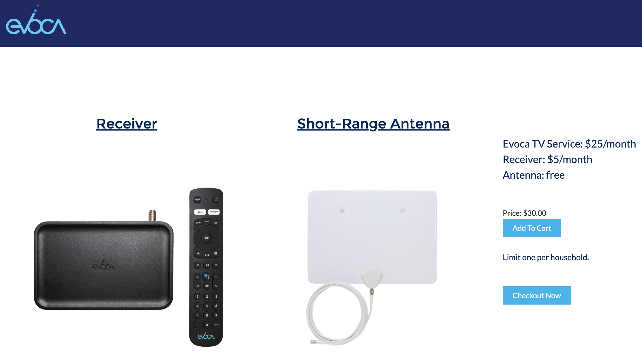
Like many services, most of the traffic to the site is on a mobile device, specifically a mobile phone. Designing a seamless experience on mobile with many selection options can lead to an almost infinite scrolling experience which could deter and confuse users. One solution would be to only make the recommended selections visible with other options available via popover. In this case, the users address is utilized to provide the most appropriate recommendation for the antenna. A receiver isn't an optional item and the service are also required.
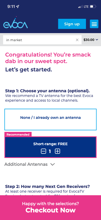
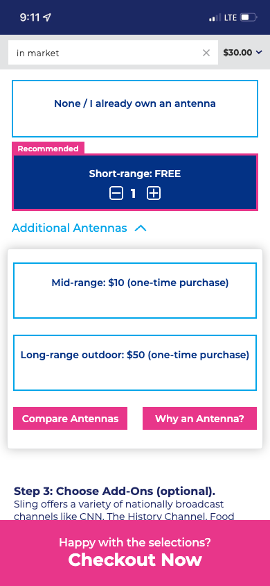
An always visible checkout button is also added to provide users a click through option that selects the recommended selections without having to manually make selections. This option utilizes their address and relative location to Evoca towers for the best antenna option for optimal over the air experience.

Conclusion
After discussing with stakeholders and welcoming feedback from various teams, we landed on a nice balance between existing design and updated usability. We hope the improved navigation for both web and mobile will help users make their selections and adjust those selections without having to start the buyflow over. Furthermore, we are leveraging a recommended default selections approach to help users make decisions about the selections in their cart.